The forecast
Read the key figures, chart, and monthly table that show when your forecast becomes tight.
The forecast is the first screen after signing in. Four key figures, a chart, and a monthly table work together to show how the balance develops and when it falls below your buffer.
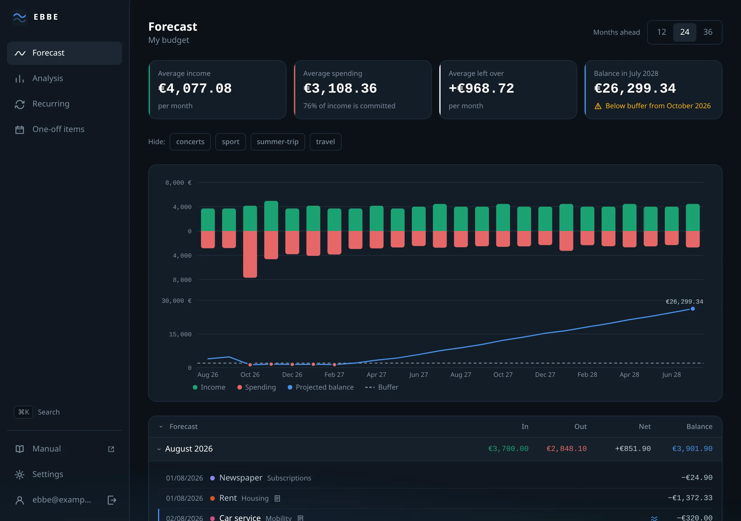
The four figures
Averages over the whole range you are looking at, not this month.
- Average income — per month, in green.
- Average spending — per month, in red. Underneath it, when there is income to compare against, the fixed-cost ratio: what share of what comes in is already committed.
- Average left over — income minus spending. Negative is possible and is worth taking seriously: it means the range you are looking at spends more than it earns, and the balance is only holding up because it started high.
- Balance in the last month — where the projection ends up, in the brand blue. Underneath, one of three sentences: that it stays above your buffer, that it drops below it from a named month, or that no buffer is set.
That last line is the headline. Everything else on the screen exists to explain it.
The chart
Two panels sharing one axis of months.
The top panel puts income above the line and spending below it, as bars. It is drawn as a pair of opposed colours rather than red-and-green so that it stays readable for colour-blind readers.
The bottom panel draws the projected balance as a line, with your buffer as a dashed reference across it. Where the line goes under the dash is the answer.
Hovering a month gives its four figures. The balance turns red when it is below the buffer.
The month table
One row per month: In, Out, Net, Balance. Balance is the projected balance at the end of that month.
A month below your buffer carries a badge saying so. A month containing an
estimated amount carries a ≈.
Narrow the window and columns drop in order of usefulness — In and Out first, then Net — leaving Balance, which is the one you came for. Nothing is lost; opening the month shows everything.
Click a row to open it. You get every payment in that month, dated, with its category, and two buttons to add a new recurring or one-off item already set to that month. The pencil on a payment opens the item behind it, so you can correct something without going to find it.
The chevron in the header opens and closes every month at once.
Hiding tags
Above the chart is a row of chips, one per tag that still has a payment to come. Pressing one takes those items out of the projection and shows what the balance would be without them.
This is the closest thing Ebbe has to a what-if. Hide summer-trip and you see
what your year looks like if the holiday does not happen. The unfiltered
balance stays on the chart as a faint second line, so you can see both at once
— that ghost line is the comparison, and it is why there is no separate
report.
Nothing is changed or saved. Reload the page and the chips are clear again.
The horizon
Top right: 12, 24 or 36 months. It changes what you are looking at, not your settings, and it is shared with the analysis and detail screens.
The default comes from Settings → Budget → Months ahead, which also offers 60. Worth stretching occasionally: a projection is only as long-sighted as its horizon, and a large payment two years out is invisible at twelve months.
When it is empty
A new account has no items, so the forecast greets you with two buttons rather than an empty chart. See getting started.